Studio Doxha | Branding
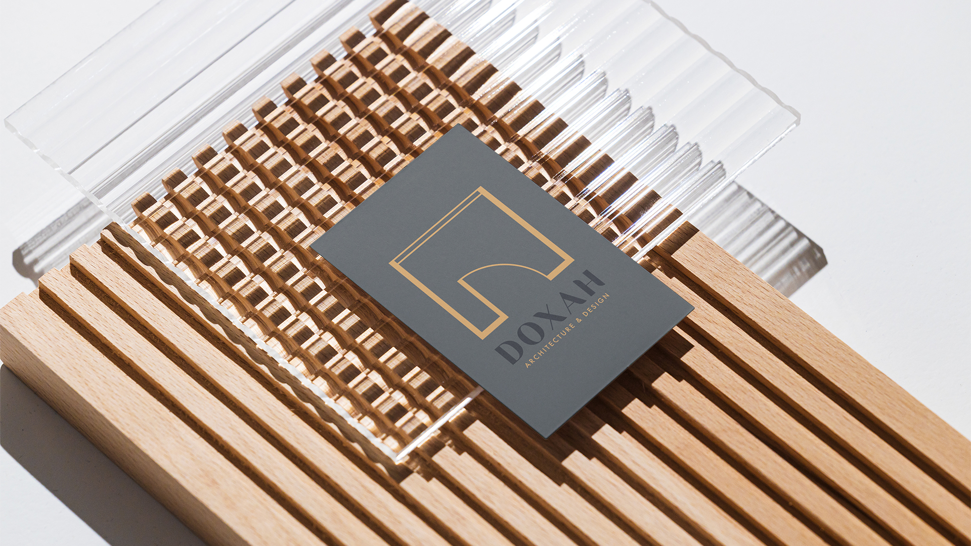
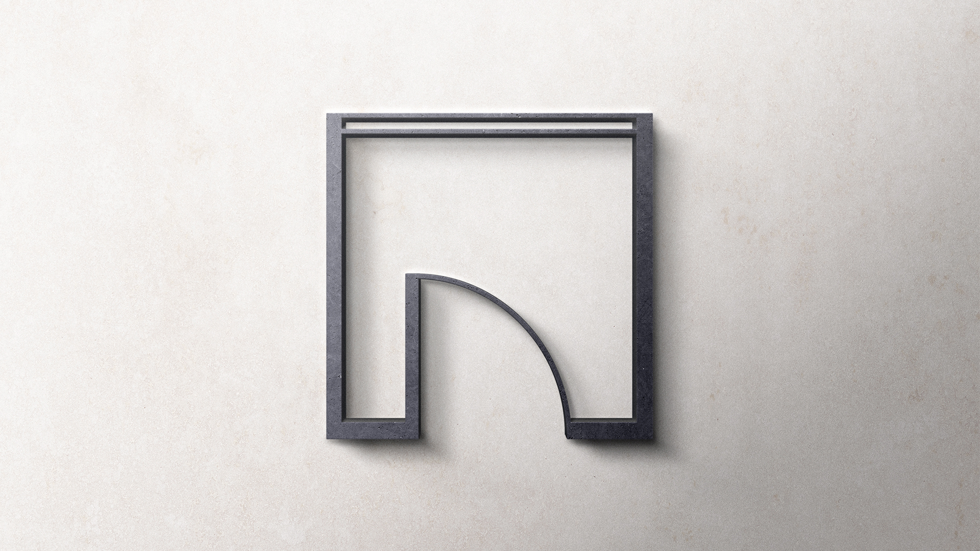
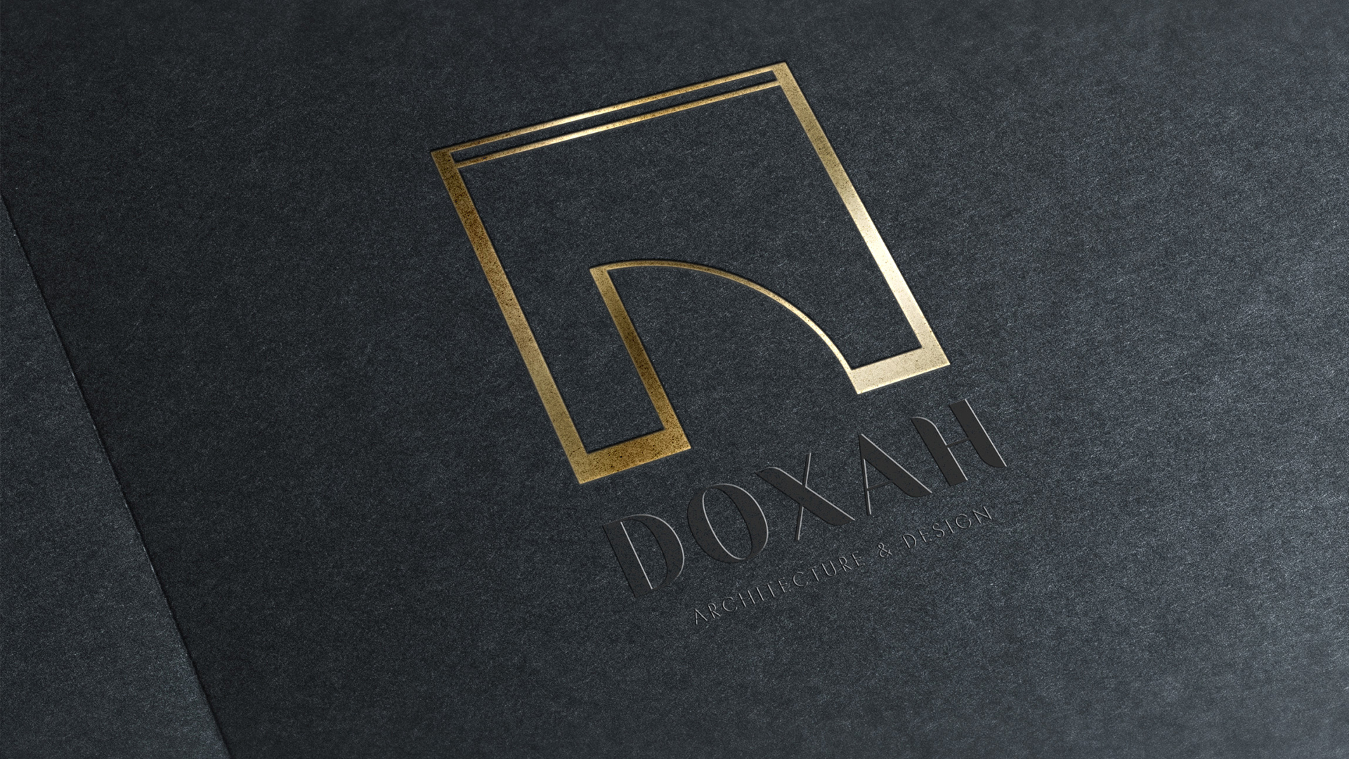
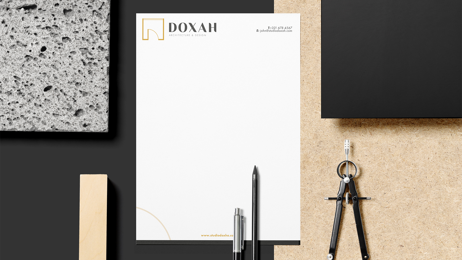
In creating the logo for Doxah, we carefully crafted an icon that relates directly to the architectural industry. The icon takes the form of a door depicted within a floor plan layout, skillfully incorporating the letter “D” to represent the studio’s name. This thoughtful fusion of architectural symbolism and typography results in a visually striking and meaningful logo.
In this design, we intentionally maintained a simplistic approach to the icon, recognising its inherent ability to effectively symbolise the architectural industry. By avoiding excessive complexity, we achieved a balance that exudes sophistication and elegance, resonating with Studio Doxah’s brand identity.
To enhance the overall visual impact and convey a sense of sophistication, we selected a colour palette that harmoniously balances light and dark tones. The deep black exudes elegance and professionalism, while the golden yellow adds a touch of warmth and vibrancy. This combination not only adds depth and contrast to the brand identity but also enhances its premium look and feel.
Date:
2021Categories:
BrandingClient:
Doxha