Compounding Capital | Branding
In response to our client’s transition to a new name, Compounding Capital, we embarked on a journey to craft a logo that embodies the essence of their identity: a privately backed multi-stage investor specialising in post-revenue, high-growth B2B SaaS companies.
In the realm of finance, establishing trust, confidence, and security is paramount. Our design approach focused on marrying modern typography with a classic touch to signify innovation while exuding sophistication.
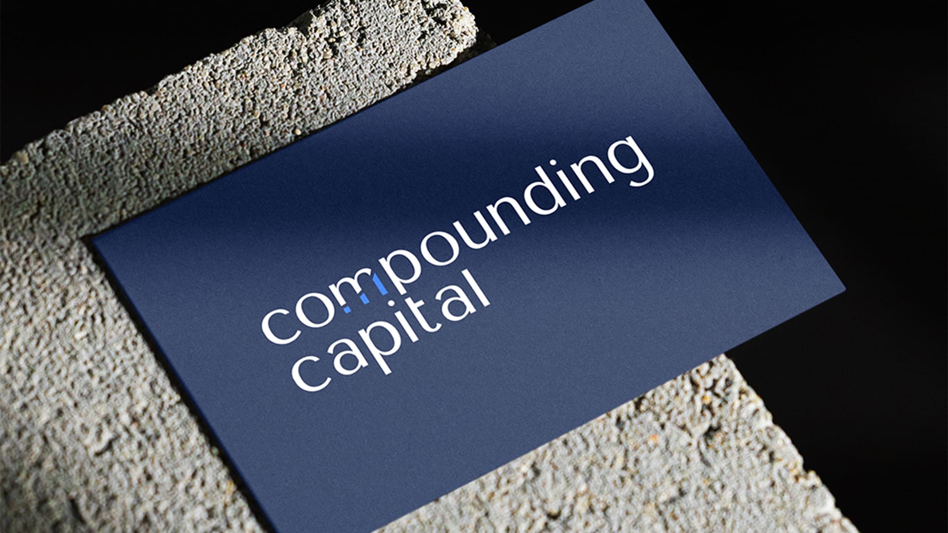
Central to the logo’s composition is the integration of the compounding graph, cleverly abstracted to resemble the letter “M”. This subtle yet distinct element serves as a nod to the company’s core principles of growth and prosperity. The choice of a striking blue hue further underscores the brand’s forward-thinking ethos, while also conveying a sense of stability and reliability.
Date:
2023Categories:
BrandingClient:
Compounding Capital